
Documentation website: the extended guide and live Workbench.
@0k/vue-split-tabs is a content-agnostic Vue 3 split and tab layout. The
controller owns saved intent, the layout algebra, and the effective layout;
components render that layout and handle gestures. Hosts own views, labels,
storage keys, routing, data, themes, and key bindings.
It preserves Keep content while views move, collapse, zoom, and restore. A host supplies every visible label: the library has no built-in strings, and a control with no label is hidden.
- A view is one host tab id, or a controller-created placeholder whose id
starts with
placeholderPrefix. Fill a placeholder with host content usingreplace(placeholder, id). - A tab set is a tab bar and the tab it shows. A tab holds a view, a layout (a cut), or another tab set (an inner bar).
- A pane is the content area of a tab set showing a view. The bar sits outside the pane, beside it. A frame is a tab set showing a layout or inner bar; its bar sits outside its frame content too.
- A cut divides an area into
rows(stacked) orcols(side by side), with a divider. Splits name where the new part goes:left,right,top, orbottom, never “vertical” or “horizontal”. - Focus is one pane; selection is several panes; group rebuilds cuts so a selection becomes one node; a scope is the area in which a pane is a tile; bar focus is the tab bar whose label was last clicked.
Commands target the selection, grouped first, or otherwise the focused pane.
tabNext adds a new tab next to the target; tabInside puts a new inner bar
in the target’s place.
Use the exported notation(tree) or reactive controller.notation to inspect
a layout. H[a b] means side-by-side, V[a b] means stacked, and (a *b) is
a bar of views showing b. A bar holding a layout is T{H[a b] | *c}.
The algebra preserves the pictured arrangement while regrouping. For example:
- Grouping the top row of
H[V[1 3] V[2 4]]producesV[H[1 2] H[3 4]]. tabNexton that selected top row producesV[T{H[1 2] | *5} H[3 4]].- In a two-tab left bar,
tabInsideon view1producesT{*(1 *3) | 2}: the new bar is inside that tab, not beside the outer bar. - Splitting a selection places a placeholder beside the whole group, rather than splitting just the last pane that received focus.
The offline Workbench demonstrates split and tab layouts with coloured,
numbered iframe views, live library options, keyboard and touch gestures, a
tree readout, and a keycast showing the last chord or gesture. Every layout
action uses the public built package; the demo supplies content, labels, and
the dark theme. Its iframes cooperate through the separate frame helper and
stay mounted through moves and zoom. Neither demo/ nor doc/ ships to npm.
Each iframe shows its own ordered event log, keyboard-focus indicator, and gesture meter. The compact Library options panel changes tab close buttons, focus borders and dimming, divider thickness, pane mouse chords, single-tab bars, context-menu items, layout keys, and event logs without reloading. Focus and selection are the library’s own marks, drawn above iframe content.
Only these options persist in localStorage. The layout uses in-memory storage
and every reload starts at H[V[1 3] V[2 4]]. Changing divider thickness keeps
the current layout but recreates its controller and iframes, resetting their
local logs. The layout starts at the top of the page.
Workbench pane clicks and drags default to Ctrl+Alt+Shift; Alt+Shift clicks belong to content. Choosing the library-default mouse chords restores Alt+Shift click/drag and Ctrl+Alt+Shift rectangle clicks. With layout keys enabled, Ctrl+Alt+Shift+arrows extend selection; an arrange-mode long press also selects rectangles.
npm run demodemo/acceptance.org maps each Workbench feature to the named real-input
scenario of npm run demo:test that proves it.
Run npm run demo:capture to regenerate these short looping clips. Each
shows one capability with its chord or gesture in the top-right keycast.
The base Workbench: four numbered views, library options, and the live tree.
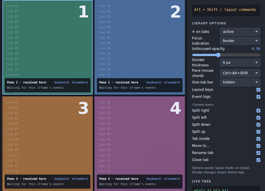
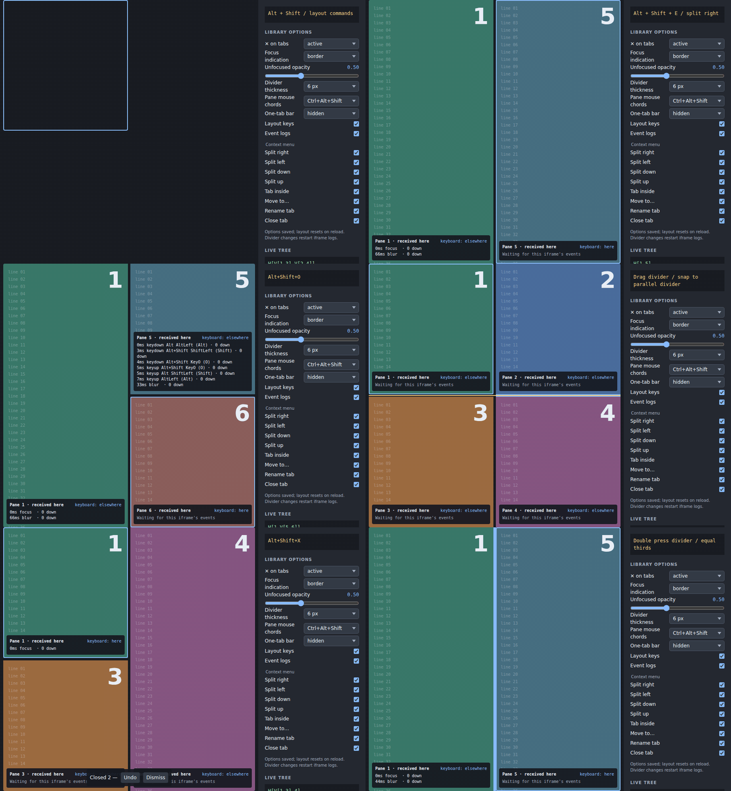
- Split: Alt+Shift+E/O split right/below, a dragged divider snaps onto a parallel divider, and a double press equalizes thirds.
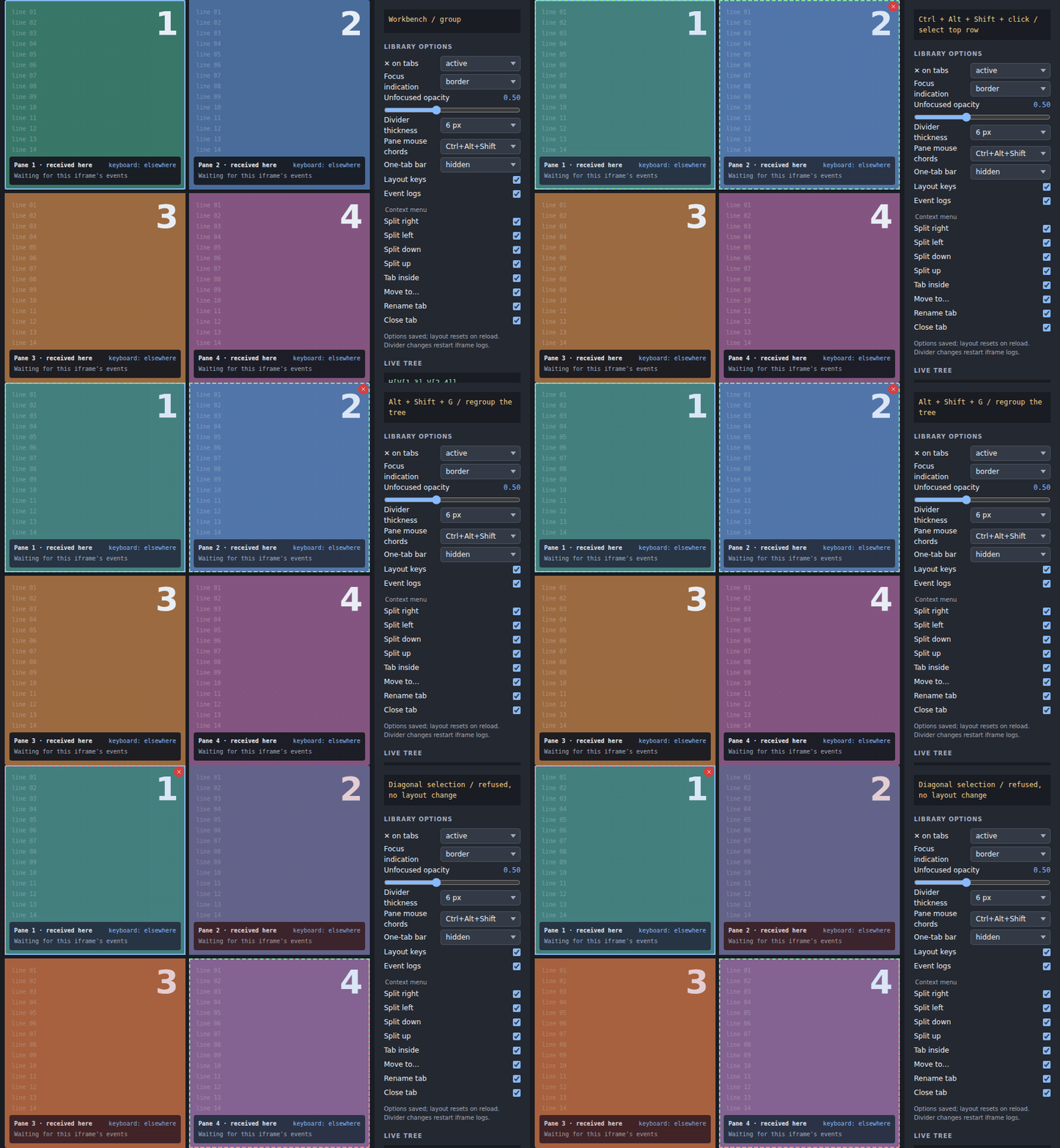
- Group: Ctrl+Alt+Shift+click selects a row with a green preview; Alt+Shift+G rebuilds the tree; a diagonal selection is refused in red.
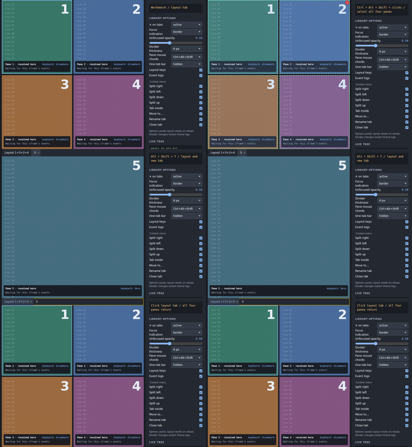
- Layout tab: Ctrl+Alt+Shift+click selects all four panes; Alt+Shift+T keeps the layout in one tab beside a new view, then click back to that layout.
- Inner tab: Alt+Shift+I and a middle drop create an inner bar, while a drop on a bar places the view next to its other tabs.

- Drag: a pane’s edge quarter splits that pane, the outer edge splits the whole area, and resting on a hidden tab spring-loads it open.

- Bars: Alt+Shift+R cycles the bar through left, bottom, right, and top, and dragging a left bar’s inner edge changes its width.

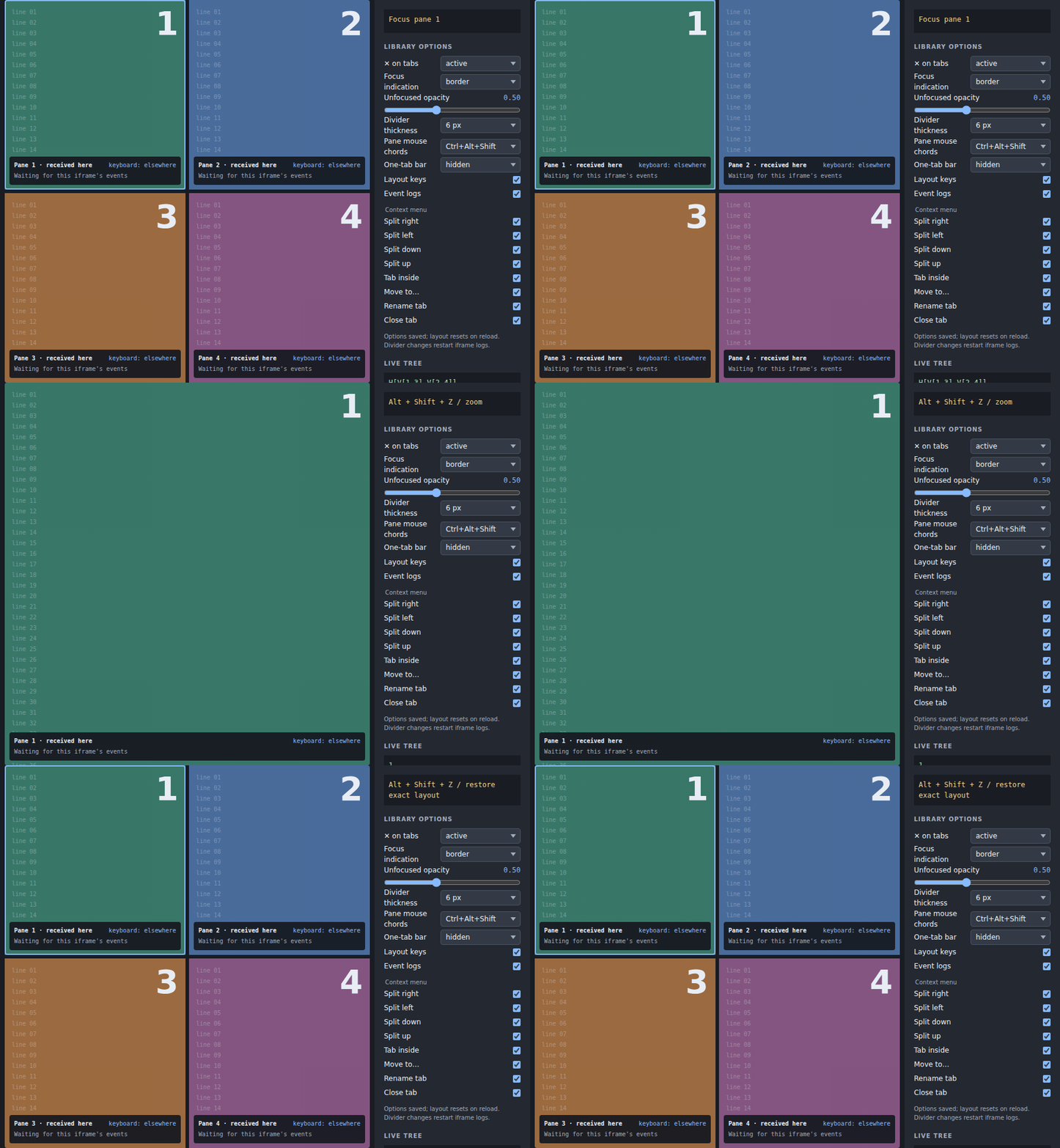
- Zoom: Alt+Shift+Z zooms the focused pane and restores the exact layout.
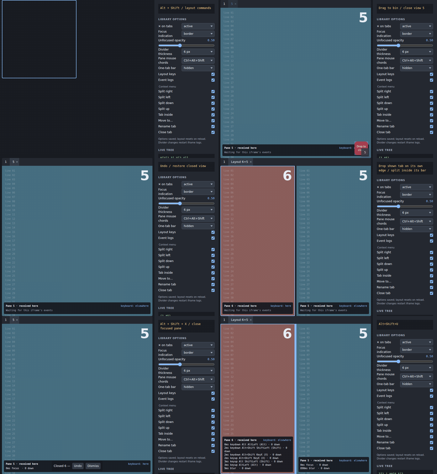
- Close: drop a view in the bin or close a pane with Alt+Shift+X, then Undo restores what was closed.
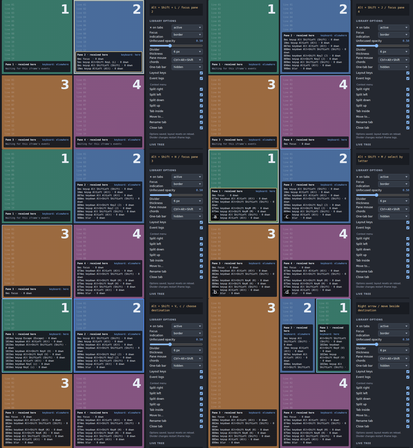
- Keyboard: H/J/K/L chords move focus, Alt+Shift+M selects by letter, and Alt+Shift+V plus a destination letter and arrow moves a pane.
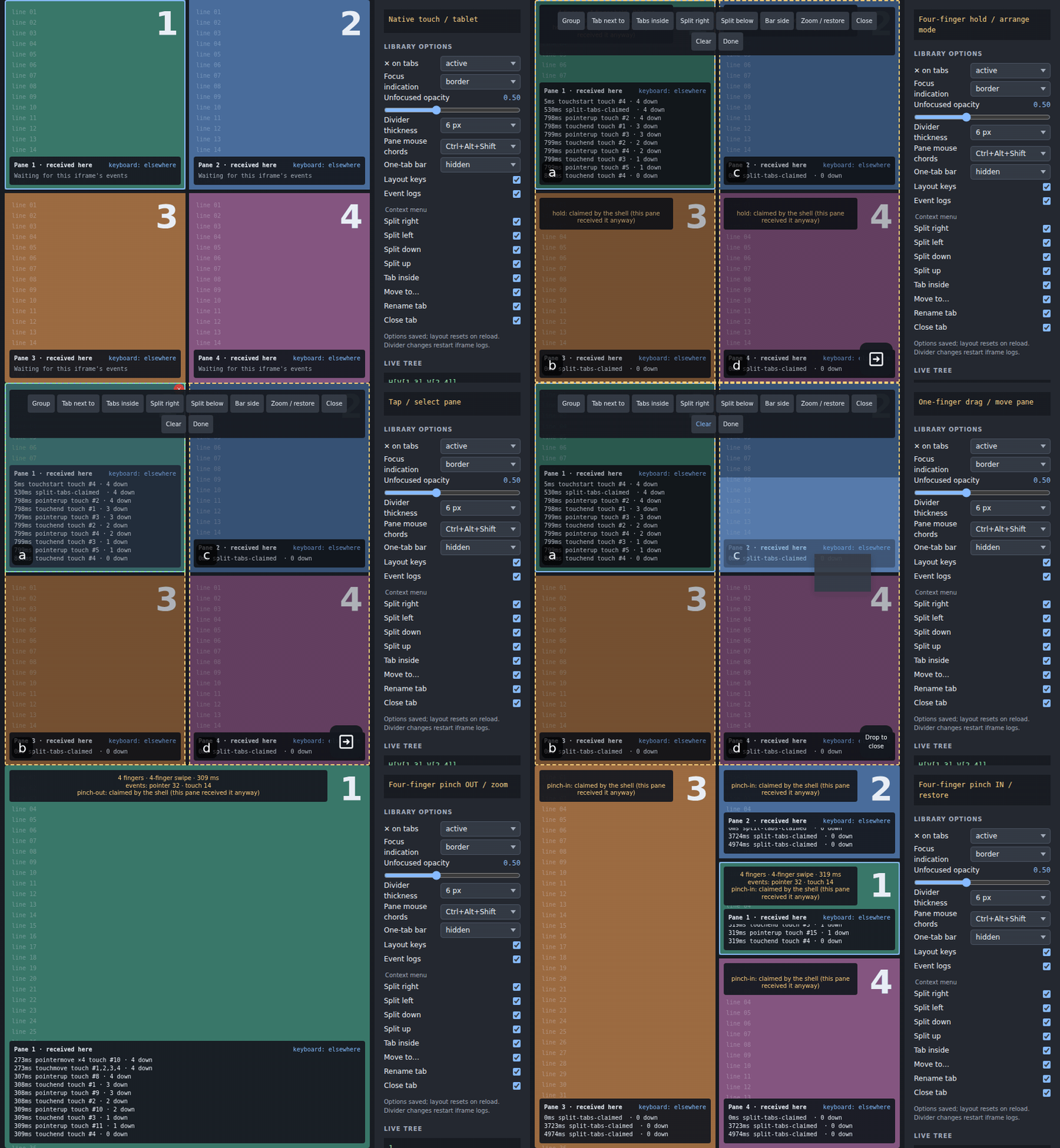
- Touch: on a tablet-sized viewport, a native four-finger hold enters arrange mode, taps select, a drag moves, and four-finger pinches zoom/restore.
npm install @0k/vue-split-tabsVue ^3.5.3 is an external peer and the package is ESM-only. Import the CSS
once: JavaScript and declarations do not import it implicitly. Give the root a
definite height.
Published component types work with TypeScript moduleResolution: "bundler"
and moduleResolution: "NodeNext"; both supported and tested with strict
consumer probes. The declaration build qualifies Vue SFC references with
.vue.js so both resolvers find the emitted .vue.d.ts files.
The controller prop is read once when SplitTabs mounts. To swap controllers,
remount the component with a changing :key="controllerKey" alongside
:controller="controller"; changing the prop alone does not replace it.
<script setup lang="ts">
import { onBeforeUnmount, ref } from 'vue';
import {
  createSplitTabsController, SplitTabs,
  SplitTabsAnchor, SplitTabsKeep,
} from '@0k/vue-split-tabs';
import '@0k/vue-split-tabs/style.css';

// Optional tabs are host tabs too: list them in tabs.
const tabs = ref(['editor', 'preview', 'report', 'frame']);
const optional = ref(['frame']);
const active = ref('editor');
const controller = createSplitTabsController({
  tabs,
  optional,
  entryKey: 'document:example',
  storageKey: 'my-app.layouts',
  active: { get: () => active.value, set: id => { active.value = id; } },
  minPaneWidth: 225,
  minPaneHeight: 175,
  placeholderPrefix: 'document:new-',
});
const labels = { divider: 'Resize panes', closeSelection: 'Close selection' };
const stripLabels = {
  close: 'Close tab',
  resize: 'Resize side bar',
};

function command(name: string, result: unknown) {
  // The host turns result reason codes into its own visible messages.
  console.log(name, result);
}

function fillPlaceholder() {
  const placeholder = controller.panes.value.find(p =>
    controller.isPlaceholder(p.view))?.view;
  if (placeholder) {
    tabs.value = [...tabs.value, 'outline'];
    controller.replace(placeholder, 'outline');
  }
}

onBeforeUnmount(() => controller.dispose());
</script>

<template>
  <button type="button" @click="fillPlaceholder">Create outline</button>
  <button type="button" @click="controller.open('frame')">Open frame</button>
  <SplitTabs :controller="controller" :labels="labels" :strip-labels="stripLabels"
    @command="command">
    <template #tab="{ id, title }">{{ title ?? id }}</template>
    <template #pane="{ pane }">
      <SplitTabsAnchor part="body" />
    </template>
    <template #keep>
      <SplitTabsKeep v-for="tab in tabs.filter(t => t !== 'frame')" :key="tab" :tab="tab" part="body">
        <div>{{ tab }} content supplied by the host</div>
      </SplitTabsKeep>
      <SplitTabsKeep tab="frame" part="body" overlay>
        <iframe title="Host-owned frame" src="/host-frame" />
      </SplitTabsKeep>
    </template>
    <template #undo="{ undo, dismiss }">
      <button type="button" @click="undo">Undo close</button>
      <button type="button" @click="dismiss">Dismiss</button>
    </template>
  </SplitTabs>
</template>
The library renders every tab set’s bar outside its pane or frame content.
The #pane slot supplies CONTENT ONLY: never render a SplitTabStrip there.
The optional #frame slot adds an absolutely positioned layer over the frame
content area. It takes no layout space and neither replaces the recursive
layout nor renders a bar. The layer defaults to pointer-events: none; set
pointer-events: auto on host controls that should receive presses.
SplitTabsAnchor identifies where a part of
Keep content is placed. #keep is instantiated once, so each
SplitTabsKeep stays mounted. Ordinary Keep content teleports to the visible
anchor. overlay Keep content is teleported once into the root layer and
positioned over its anchor, which avoids moving and reloading an iframe. An
overlay Keep registers its part, so every matching anchor gets the flex layout
needed to occupy its pane.
Intent is { version: 3, tree, focus, opened, titles? }, with optional
titles: Record<string, string> keyed by a view id or a layout/inner-bar node id.
Existing version-3 layouts without titles stay valid (no version bump).
Blank titles and titles whose keys are absent from the tree are dropped on read,
before new node or placeholder ids are allocated.
Titles follow keys through moves. New grouping nodes inherit no title;
dissolved or closed keys lose their titles on the next write. Replacing a
placeholder drops its title rather than copying it to the real view. Close
undo restores the titles too. The unlimited-depth tree
contains cuts and tab sets; node ids and view ids are unique and never reused
within one controller lifetime, including ids read from storage. A tab set with
one nested tab set dissolves into that tab; a nested one-tab bar is replaced by
its tab; bars with two or more tabs never merge.
A bar with one tab is hidden by default, even in a split layout. Set
alwaysShow on SplitTabs to show it. Bars may be top, left,
bottom, or right; left and right bars are vertical and have a persisted,
resizable barWidth.
alwaysShow accepts a boolean (default false) or
(tabSet: SplitTabsTabSet) => boolean. The policy receives the tab set;
use its identity or tabs, not measured geometry, to choose individual bars.
An alwaysShow policy must not read the controller: projection-derived
reads throw a split-tabs: error during projection evaluation. To show bars
only when split, compute a boolean in the host render instead:
:always-show="controller.hasSplit.value".
hasSplit counts visible panes in the unzoomed folded working tree, before
size collapse; zoom does not change it. isSplit instead describes the
rendered layout, after zoom and collapse. Never drive alwaysShow from
rendered-layout values (isSplit, panes, fits, layout, etc.), even
through a host-render boolean: visible bars change minima and can make that
layout alternate forever between split and collapsed.
This presentation policy never writes storage. It also feeds size collapse,
divider clamps, keyboard nudges and equalization: each visible bar counts in
its tab set’s minimum, including bars beside view panes, not just frames.
Customize the bar with #tab { id, active, kind, views, title } and extra controls
in #bar-start { tabSet } / #bar-end { tabSet }. These slots receive the
effective SplitTabsTabSet object. End controls hide with the bar. When an
add button must remain available, request a bar for that tab set:
<SplitTabs :controller="controller" :labels="labels"
  :always-show="tabSet => canAdd(tabSet.id)">
  <template #tab="{ id, kind, views, title }">{{ title ?? (kind === 'view' ? id : views.join('+')) }}</template>
  <template #bar-end="{ tabSet }">
    <button type="button" @click="addTo(tabSet.id)">+</button>
  </template>
  <template #pane><SplitTabsAnchor part="body" /></template>
</SplitTabs>
Here canAdd and addTo are host functions. A requested bar is simpler
than a second hidden-bar control location: one slot, one owner and one
minimum-size policy. With the bar hidden, no space is reserved and the pane
fills the entire tab-set box.
Inline arrows such as the example above are safe when the HOST RENDER reads
the controller’s computed members, not the policy itself: a fresh function
identity with unchanged results does not invalidate the layout. Changing the policy’s
results updates bars live. Bar-side commands target a shown one-tab bar too,
including the bar whose label was last clicked.
Persist intent.tree, not the effective layout. The effective layout is a
projection for the current container: it has panes, frames, and cuts with
geometry. SplitTabsPane has an id, visible tab keys, shown view, index,
fits, and collapsed flag. A collapsed pane represents a whole subtree.
Effective width~/~height metadata describes the outer tab-set allocation,
including its bar; measure [data-pane-id] for the actual content rectangle.
Size collapse is top-down and never writes intent: when a cut cannot fit two
minimum panes, their visible bars and its divider, its subtree renders as one pane listing its
visible views. Its exact tree returns when space returns. Divider drags and
keyboard nudges clamp against the same full subtree minima, including every
visible bar and divider. A nudge that cannot move returns at-limit without
writing storage; derived size, host tab-list changes, and host
navigation do not write storage.
Visible views are placeholders, or present non-optional views, or opened
optional views. Present visible host views absent from the tree are derived in
the first pane after their nearest placed natural predecessor. Absent views
keep their place. A pane click or focusPane saves a changed focused view immediately.
Directional keyboard focus via focusDirection stays in memory until the next write.
Selection, bar focus, and zoom are memory-only. The host active binding follows the
focused pane’s shown view; a visible host request reveals its path without a
write. The getter may catch up with set later, as an asynchronous router
does: until it shows the last value set, the values it passes through (the
one it showed before, and those set since) are not host requests.
If an action requests the value the getter already shows, pending values stay
protected across Vue ticks for up to 250 ms, or until the getter acknowledges
the latest request or supplies a new value. The bounded delay also handles
routers that cancel the earlier request and drop the duplicate without changing
their getter; later host navigation is honoured after that delay. dispose()
clears this fallback timer.
Commands act on the selection after grouping it when possible, otherwise on
the focused pane. split(side), tabNext(), and tabInside() create fresh
placeholders for the host to replace. group() refuses a non-rectangular
selection with not-groupable and the panes in the way. Layout-changing
commands restore zoom first; zoom itself is memory-only except for any grouping
needed to form its target.
closeTarget() closes only optional views and placeholders. If any visible
view is non-closable, the whole close is refused with not-closable. Closing
leaves a one-shot undo snapshot; the root exposes it through #undo for
undoTimeout milliseconds after each close (undoSerial rises with each one,
so a later close starts the wait again). cycleBarSide() cycles a visible target bar
through top, left, bottom, and right.
The drag model is shared by internal and external drags. A tab-bar drop adds the item next to the other tabs at its marker. A pane middle drop adds it inside, creating an inner bar. A pane outer quarter splits that pane. A thin frame band splits beside the framed tab set, and a root band splits the whole area. The bin, shown while dragging, closes an internal dragged view, pane, or selection.
During a drag, a hidden one-tab pane has a drop strip where its bar would
appear, on its configured side (barThickness high, or barWidth wide).
Entering that strip previews its shown tab and an insertion marker; dropping
adds a tab NEXT to it. Elsewhere, quarters and middle use the content minus
that strip. The source’s own pane keeps its self-drop behavior, without a strip.
A groupable selection of at least two panes acts as ONE cluster for a source outside every member’s tabs/views. Its rectangle includes member tab-set boxes and frames containing only members. Bin, root bands and non-member frame bands keep precedence; the cluster overrides member bars and zones. If the grouped selection has no visible direct holder bar, a one-tab layout bar pops out over the rectangle’s full top edge as soon as the pointer enters anywhere in it, and remains throughout the rectangle. Its label represents all member views, including non-shown tabs. Drop on that bar to add beside the group, in a content quarter to split beside the group, or in its middle to add inside. Quarter shades span half the cluster rectangle; middle excludes the preview strip. With a visible direct holder, no bar pops out and quarters and middle use the entire rectangle; the real holder bar remains a bar target.
The shared .split-tabs-bar-preview overlay reuses bar/item/title classes,
tabClass and the root #tab slot, is pointer-inert and aria-hidden, and has
no real target data attributes. data-root-edges names the root edges it
touches, so a host that draws controls over the root’s corners can keep the
previewed label clear of them as it does for real bars. It sits above Keep/iframe content and below
drop markers, using --split-tabs-overlay-z-index. No space is reserved and
no tree, focus, selection or storage change occurs on hover. Leaving the
cluster/strip or ending the drag removes it; this does not show one-tab bars
by default. A cancelled drag or release outside all zones does not apply grouping.
move(source, zone) accepts a view, a node, or the current selection. A
selection is grouped first. canMove is the non-mutating dry run, including
prospective external view ids before host registration. Moves and
drop results are atomic; an invalid target changes nothing.
Any zone’s target may be "selection", meaning the current selection,
grouped first (like "root" names the whole area for a split). For a
selection bar drop, index: 0 means immediately BEFORE the group, null
means immediately AFTER it, in its existing holder or a new bar in its place.
A whole pane brings its tabs, never its bar; the dropped content becomes shown.
Inside/split zones use the grouped node. An empty selection is unknown,
an ungroupable one returns not-groupable, and a selection source targeting
"selection" returns into-itself. insert uses the same target semantics.
Dropping a pane or its SHOWN tab’s label on its OWN outer quarter splits
INSIDE the shown tab in equal halves. Its content goes on the dropped side,
and a fresh placeholder fills the opposite side; the bar keeps its other tabs
and shows the new layout tab. For example, an own-right drop in (A *B)
produces T{A | *H[new:1 B]}: A stays untouched, and switching back to B’s
layout restores the split. A one-tab set normalizes to H[new:1 B]. Focus goes
to the new placeholder, consistently with split(). The host fills it through
replace as usual. A pane drag onto its own middle is refused (into-itself).
Dragging a lone tab label onto its own middle or bar instead returns
nothing-to-move. Both refusals leave intent and storage unchanged.
The only visible tab follows the shown-tab rule, preserving hidden siblings
outside the new layout tab.
Frames keep their whole tab set on their existing own outer-band drops.
A NON-shown label dropped on its own pane edge still separates just that
tab without creating a placeholder: it is not the content being shown. Selections self-split
only when their grouping plan is single; dropping a larger group onto a
member remains refused. No other layout-grammar rule changes.
Both equal halves must fit their subtree minima (including bars) and the
divider; otherwise canMove and move return no-room without changing
intent or writing storage. Successful moves still write once; undo remains
the existing close-only snapshot. This rule is shared by arrange touch drags,
mouse pane-chord drags, keyboard move (own letter then arrow), tab-menu direction actions,
and the API.
Self-drop previews show the content side with .split-tabs-drop-shade and
the opposite half with .split-tabs-drop-shade.split-tabs-drop-preview--new.
Both receive data-refused on refusal. The latter has a distinct background
and inset shadow, styled through --split-tabs-drop-new-background and
--split-tabs-drop-new-shadow; its optional text is labels.newPane. Without
that host label it has no text: the library supplies no wording.
Key bindings belong to the host. SplitTabs defaults its keymap prop to
defaultKeymap; pass a changed map, spread and override defaultKeymap, or
pass null to bind nothing. Commands remain callable through controller
methods and the root component ref’s run(command). The command event gives
the command and a structured result; hosts supply any displayed wording.
On a focused tab label, Alt+Shift+Left/Right reorders horizontal bars and Alt+Shift+Up/Down reorders vertical bars. This is tab-bar reordering, not a layout command.
Every tab is renamable by default, including layout and inner-bar tabs.
Double-click a label to replace it with an inline input. Its value is the
current custom title (empty when unset); Enter or blur commits, Escape
cancels without exiting arrange or another layout mode. Leaving the strip or
unmounting the editor commits an unfinished edit exactly
once, like blur. Pane pickers leave the editor’s typing and Enter alone;
modifier releases still update the shell’s pane covers. Whitespace is trimmed;
empty clears the custom title. SplitTabs.renamable accepts a boolean or
(key: string) => boolean, default true; false hides rename menu items
and disables double-click editing. This is a UI policy, not an API restriction.
Root labels.renameInput?: string supplies only the input’s accessible name;
there is no built-in placeholder, label or visible string.
Hosts with their own tab menu can call the root component ref’s
startRename(key: string): boolean to open that same inline editor, initialized
with the current title. It returns false for an unknown key, a key disabled by
renamable, or a tab without a rendered, visible bar (including a hidden
single-tab bar). On false, the host should fall back to its own prompt and
commit through controller.rename(key, title). Starting an edit does not write
storage; committing reports command('rename', result) as usual.
Pass menuLabels: SplitTabsMenuLabels to SplitTabs to enable its one
SplitTabsMenu. All wording belongs to the host. A missing item label hides
that item; no labelled available items leaves right-click to the browser.
Right-click opens at the pointer. A touch/pen hold arms at 350 ms; lifting
without dragging opens the menu there, while movement starts the normal drag.
On a focused label, ContextMenu or Shift+F10 opens below the label. Placement
flips and clamps inside the window, including after resize.
| Label key | Control / meaning |
|---|---|
menu | Menu accessible name |
right, left, down, up | Split toward that side: a lone visible tab self-splits, as does any shown tab, inside its shown entry with an opposite placeholder; a non-shown tab separates alone |
inside | Move the tab inside its tab set’s shown content, only if canMove allows it |
move | Numbered destination picker (three or more panes) |
otherPane | Move to the other pane (exactly two panes) |
close | Close, offered only when isClosable(tab) |
rename | Start inline editing, offered only when renamable |
noRoom | Disabled reason for no-room |
onlyTab | Disabled reason for nothing-to-move or into-itself |
menuItems?: readonly SplitTabsMenuItem[] controls order and subset. Default:
['right', 'left', 'down', 'up', 'inside', 'move', 'rename', 'close']. An empty array
disables the default items. The move item uses otherPane, not move, in
the two-pane case. Hover or focus on move previews pane numbers; activating
it (or pressing M) starts useSplitTabsPick().start(tab). Digits 1–9 also
choose a numbered destination directly while the menu is open. The picker
is shared with the root’s other move controls.
ArrowUp/Down cycle enabled items, Enter/Space activates a focused button,
and the unified exit keys or outside press close and restore label focus. The menu has
role="menu"; items are buttons with role="menuitem".
Append host actions through #menu-extra="{ tab, tabSet, close }" on the
root. Give those buttons role="menuitem" and class="split-tabs-menu-item"
to share keyboard navigation and styling, and call close() after acting:
<SplitTabs :controller="controller" :labels="labels"
  :menu-labels="{ menu: 'Tab options', right: 'Split right', close: 'Close' }"
  :menu-items="['right', 'close']">
  <template #menu-extra="{ tab, close }">
    <button type="button" role="menuitem" class="split-tabs-menu-item"
      @click="inspect(tab); close()">Inspect</button>
  </template>
</SplitTabs>
The exported SplitTabsMenu also accepts controller, tab, tabSet,
anchor: HTMLElement, optional point: { x, y } | null, labels and
items, renamable (same policy, default true), exposes #extra { tab, tabSet, close },
and emits close and rename(key: string). The root handles rename by opening
its bar’s editor; standalone hosts handle that event themselves. Strips
inside a root normally open the root-owned instance automatically.
Touch is first class. A label touch or pen press holds before dragging; a
movement before arming is left to browser scrolling. Four-finger hold toggles
arrange mode; holding a divider still also toggles it. Four-finger pinch out
zooms the pane under the fingers (or the selection), and pinch in restores.
The arrange command toggles the same mode.
From the third finger a touch sequence belongs to the layout. Each root counts
only touches starting inside it and reports from its own iframes, never fingers
in other roots or host content. The library
cancels touchstart and touchmove while three fingers or more are down, so
the browser never starts its own pan or zoom and the content under the
fingers does not scroll, and it covers every pane (the arrange-mode cover)
until all fingers lift, so taps and moves reach neither page content nor
iframes. One and two fingers stay with the content (scrolling, pinch-zoom);
what they did before the third finger landed cannot be undone. Touch events
are the source of truth. Touch pointerdowns and iframe down reports count as
provisional fingers and arm the owning document’s blocker immediately:
Chromium routes touches to the first finger’s document, even when later
fingers land elsewhere. Touch snapshots replace the hints; pointer up/cancel
drops only hints not yet reported by touch events. Android System WebView’s
pointercancel therefore cannot break a continuing touch hold or pinch.
Other-document touches are checked against this root’s geometry, so fingers
outside it never count. The cancelling
listener is non-passive only while at least two fingers remain, and is removed
after 2.5 seconds of touch silence or on disconnect/unmount, so one-finger
scrolling never waits for the page. While the modifiers of an enabled
pointer chord are held (see pointerChords) or arrange mode is active, panes
are covered above overlays so layout clicks and drags reach the shell; every
other press focuses its pane and stays with the content.
Every modal mode has library-owned keyboard exits, independent of the host’s
keymap: exitKeys?: readonly string[] | null defaults to
['Escape', 'Ctrl+KeyG', 'Ctrl+KeyD'] (also exported as defaultExitKeys).
Pass [] or null to disable, or supply physical chords with the same strict
validation, exact modifiers and AltGraph exclusion as keymaps. While a mode
is active, the library captures these keys on window before page content:
Arrange exits together with its drag (including armed presses), menu or picker.
The inline title input owns its typing keys: Escape cancels its edit only.
Outside arrange only the innermost mode exits per press. Keydown, held repeats and keyup are
cancelled and stopped, including immediate propagation. Capture listeners
are removed after the mode and its consumed release end, and on unmount.
Without a mode, exit keys alone do not take any input, including in iframes;
separate command bindings still apply. clear clears selection or bar focus,
not modal state.
Arrange mode isolates the entire page: capture-phase keydown/keyup, pointer,
mouse, click/double-click/context-menu, wheel and touch events are cancelled
with both propagation stops. Only the library’s own arrange UI (covers, bar
labels, menus, bin, #undo and #arrange slots) receives interaction; content and pane
iframes receive nothing. Pane letters toggle selection, skipping q.
The bound arrange chord exits the mode (Alt+Shift+A by default); other layout
chords stay swallowed. Tab/Shift+Tab cycle enabled controls in the host Done
slot, library menus and undo slot, never page or pane content or the
pointer-only drag bin. The inline
rename editor retains its own typing keys and Escape.
arrangeExitKeys?: readonly string[] | null adds arrange-only exits to
exitKeys (default ['KeyQ']; [] or null adds none). Plain physical Q
and the bound arrange toggle are controls, not content input. Invalid
arrangeExitKeys chords throw at mount, like invalid exitKeys.
Plain Q exits arrange by default, never letter-selects a pane. Every exit,
including done(), command toggle and four-finger hold, clears selection and
bar focus. Outside arrange, ordinary input behavior is unchanged.
labels.arrangeMenu enables the bottom-right arrange-menu button (hidden
while dragging so it never overlaps the bin). arrangeMenuLabels supplies
labels for splitRight, splitLeft, splitBelow, splitAbove, tabNext,
tabInside, group, zoom, restore, barSide, close, undo, done.
Missing labels hide items; restore replaces zoom when zoomed. Its optional
reasons: Partial<Record<SplitTabsReason, string>> words disabled refusals.
arrangeMenuItems?: readonly SplitTabsArrangeMenuItem[] controls order and
subset; default order is the preceding list without restore (which is a
label, not an item). Group appears with at least two selected panes, Undo
only when available. Commands act on the selection, else the focused pane;
splits create placeholders, not host views. controller.canTarget(command:
SplitTabsTargetCommand): SplitTabsResult previews these commands without
writing intent or allocating real ids.
Use the existing #arrange { run, done } slot for a visible host-labelled
“Done” control; done() ends arrange mode and clears selection/bar focus.
The host can position .split-tabs-arrange and size/style its own button,
including an icon. No label is built into the library:
<template #arrange="{ done }">
  <button type="button" @click="done">Done</button>
</template>
Iframes do not bubble their events to the shell. Use the separate
@0k/vue-split-tabs/frame entry from inside an iframe; its helper forwards
presses, keys, and touch reports. The shell accepts reports only from iframes
inside its root and allowed frameOrigins (its own origin by default). A
2.5-second silence clears reported fingers.
Storage is one LRU table under storageKey, with entries
{ key, stamp, intent }. It refreshes and validates before each write,
replaces only the current entryKey, and preserves in-memory operation when
storage throws. Changed user actions write once; untouched new keys create no
entry. 0.2 trees and 0.1 two-pane entries migrate on read to equivalent tab
sets. dispose() stops controller watchers.
| Before | 0.3 |
|---|---|
place, moveTo, split(id, orientation, pane), splitAt, insertSplit, and insert(id, pane, beforeId) | Replaced by move(source, zone), canMove(source, zone), and insert(id, zone, register?); commands create placeholders. |
select(pane, id) where pane was a pane only | select(tabSet, key) keeps selection semantics; a tab set can be any visible bar. |
intent.order, intent.firstActive, and intent.ratio | Removed; intent is v3 { version, tree, focus, opened, titles? }. |
canOfferSplit and ratio controller members | Removed; use effective fits, cuts, and explicit cut methods. |
defaultRatio option | Removed; ratios live in the cut tree. Use commitRatio(ratio, cut) to resize a cut or equalize(cut) to balance it. |
dividerSize: 0 | Values below 1 now throw at controller creation; choose a thickness of at least 1 px. |
PaneNode type export | Replaced by TabSetNode; a tab set holds views, layouts, or other tab sets. |
Host-rendered SplitTabStrip inside #pane or #frame | Remove it. SplitTabs renders all bars outside content; move labels, closeButton, alwaysShow, tabClass, iconClass and #tab to the root. |
Strip #end host controls | Move to root #bar-end="{ tabSet }"; #bar-start provides the other end. Request alwaysShow for any set whose controls must remain visible. |
| Pane selectors included the bar | .split-tabs-tabset[data-tabset-id] is the whole box; .split-tabs-bar[data-bar-id] is its bar; .split-tabs-pane[data-pane-id] is content only. |
Standalone SplitTabStrip prop pane | Renamed to tabSet; standalone use only, not inside root content slots. |
labels.rows / labels.cols and per-tab split buttons, splitButtons, --split-tabs-icon-size, --split-tabs-icon-hit-size | Removed: split by dragging a tab, by the keymap, or by the tab context menu. |
startExternalDrag(event, id, ghost, labels, beforeDrop) | startExternalDrag(event, id, ghost, beforeDrop). |
Old TabDropTarget | Now carries a bar, inside, split, or bin target plus its checked result and preview geometry. |
.split-tab-strip-marker[data-before] and --split-tabs-marker-width | Removed; style .split-tabs-drop-shade[data-marker] with --split-tabs-marker-color. Geometry sets its size. |
SplitSide | Removed in favour of Side (union below). |
paneKey | Replaced by tab-set injection; descendants use their containing tab set. |
| Centre pane drop moved to another pane | Centre drop creates an inner bar inside the zone. |
| One-tab bars shown when split | Hidden by default; use :always-show="controller.hasSplit.value" on SplitTabs to show bars when the unzoomed working tree is split, even if size-collapsed. |
Existing stored 0.1 and 0.2 data migrates when read, but TypeScript callers must move to the tree and zone APIs.
Side is 'top' | 'right' | 'bottom' | 'left'.
| Option | Type / meaning |
|---|---|
tabs | Required MaybeRefOrGetter<readonly string[]> of host ids in natural order. |
optional | Optional MaybeRefOrGetter<readonly string[]>, a subset of tabs; hidden until opened and closable. |
active | Optional { get(): string; set(id: string): void } binding for the focused view; get may lag behind set. |
entryKey | Required MaybeRefOrGetter<string> page identity. |
storageKey | Required storage-table key. |
storage | Optional SplitTabsStorage with getItem, setItem, and removeItem. |
maxEntries | LRU capacity; default 50, minimum 1. |
minPaneWidth, minPaneHeight | Required pane minima in pixels. |
dividerSize | Divider thickness in pixels, at least 1; default 6. A plain number or a MaybeRefOrGetter<number>: a ref or getter re-lays the panes when it changes, without writing storage. Smaller, NaN or infinite values throw at creation, or when dividerSize is next read after a change. The grab zone stays at least 8 px. |
barThickness | Actual top/bottom bar thickness, including padding; default 32. Included in collapse and divider minima. |
sideBarWidth | Default left/right bar width; default 96. |
snap | Grouping alignment tolerance in pixels; default 40. |
placeholderPrefix | Prefix for controller-created views; default split-tabs:new-. |
Reactive ComputedRef members are layout, panes, frames, cuts,
tabSets, isSplit, hasSplit, orientation, fits, focus, selection, plan,
barFocus, zoomed, canUndo, undoSerial, restoredActive, opened,
intent, and notation. dividerSize, sideBarWidth and barThickness are readonly numbers;
dividerSize reads the current value of a reactive option.
SplitTabsPlan.holder: string | null is the visible tab set of which the
prospective group would be a DIRECT tab (2+ visible tabs or alwaysShow),
or null. It is computed on a copy, without changing saved intent or writing.
hasSplit is true for two or more visible panes in the unzoomed folded
working tree, independent of container size and alwaysShow. isSplit is
true for two or more rendered panes, after zoom and size collapse.
| Method | Exact signature |
|---|---|
paneOf | Union signature below. |
scopes | (pane: PaneId): string[] |
tabSet | Union signature below. |
describe | Union signature below. |
isOptional | (id: string): boolean |
isPlaceholder | (id: string): boolean |
isClosable | (key: string): boolean |
focusPane | (pane: PaneId): void |
toggleSelected | (pane: PaneId): void |
selectRectangle | (pane: PaneId): void |
setSelection | (panes: readonly PaneId[]): void |
clearSelection | (): void |
focusBar | Union signature below. |
focusDirection | (side: Side, extend?: boolean): SplitTabsResult |
select | (tabSet: string, key: string): void |
switchTab | (delta: number): SplitTabsResult |
reorder | (tabSet: string, key: string, delta: number): SplitTabsResult |
rename | (key: string, title: string): SplitTabsResult; trimmed, empty clears, unknown key returns unknown; one write only when changed. |
titleOf | Union signature below; reactive inside Vue renders/computeds; null when unset or key removed. |
open | (id: string, pane?: PaneId): void |
close | (key: string): SplitTabsResult |
replace | (oldId: string, newId: string): void |
group | (): SplitTabsResult |
split | (side: Side): SplitTabsResult |
tabNext | (): SplitTabsResult |
tabInside | (): SplitTabsResult |
closeTarget | (): SplitTabsResult |
zoom | (pane?: PaneId): SplitTabsResult |
restore | (): SplitTabsResult |
toggleZoom | (pane?: PaneId): SplitTabsResult |
cycleBarSide | (): SplitTabsResult |
setBarWidth | Union signature below. |
setBarWidthLive | Union signature below; shown at once, not saved; setBarWidth commits. |
undo | (): SplitTabsResult |
dropUndo | (): void |
move | (source: SplitTabsSource, zone: SplitTabsZone): SplitTabsResult |
canMove | (source: SplitTabsSource, zone: SplitTabsZone): SplitTabsResult |
insert | (id: string, zone: SplitTabsZone, register?: () => void): SplitTabsResult |
merge | (): void |
nudge | (px: number): SplitTabsResult |
equalize | (cut?: string): void |
setRatioLive | (ratio: number, cut?: string): void |
commitRatio | (ratio: number, cut?: string): void |
setContainerSize | (width: number, height: number): void |
setAlwaysShow | (policy: SplitTabsBarVisibility): void; presentation-only. Managed by the root’s alwaysShow prop while mounted; resets on root unmount. |
dispose | (): void |
Union signatures (kept outside tables for Markdown compatibility):
paneOf:(view: string): PaneId | nulltabSet:(id: string): SplitTabsTabSet | undefineddescribe:(key: string): SplitTabsEntry | nulltitleOf:(key: string): string | nullfocusBar:(tabSet: string | null): voidsetBarWidthandsetBarWidthLive:(tabSet: string, width: number | null): void
Commands return SplitTabsResult. Success is { ok: true, kind?, node?,
view? }. Failure is { ok: false, reason, nodes? }. Either may additionally
carry selfSplit: true for a self-split move, including no-room previews.
Reasons are
selection-too-small, not-groupable, no-room, into-itself,
nothing-to-move, no-bar, no-split, edge, zoomed, not-zoomed,
fills-area, not-closable, unknown, and at-limit. The library never
maps a reason to a visible message; the host does so from @command.
closeButton (on SplitTabs for every library-owned bar)
says when a closable tab shows its ✕. Only closable tabs (placeholders and
optional host tabs) ever get one, and only when labels.close is given.
| Value | ✕ shown on |
|---|---|
"active" (default) | the shown tab only: a click on another tab selects it and can never close it |
"hover" | the shown tab, and any tab under the pointer or keyboard focus |
"always" | every closable tab |
"never" | none; close with the keyboard, the bin, or the host |
A ✕ that is not shown is not rendered, so it cannot take a click.
| Component | Props | Slots / events |
|---|---|---|
SplitTabs | controller, required labels: { divider, closeSelection?, newPane? } plus optional renameInput? and arrangeMenu? labels; optional stripLabels, alwaysShow, tabClass, iconClass, renamable, menuLabels, menuItems, arrangeMenuLabels, arrangeMenuItems, arrangeExitKeys, keymap, exitKeys, displayPanesTimeout, pointerChords, closeButton, undoTimeout, frameOrigins | Content-only #pane { pane }, #frame { frame }; #tab { id, active, kind, views, title }, #bar-start { tabSet }, #bar-end { tabSet }, #keep, #menu-extra { tab, tabSet, close }, #undo { undo, dismiss }, #arrange { run, done }, #bin; emits command(command, result); ref exposes startExternalDrag, run and startRename(key: string): boolean. |
SplitTabsMenu | controller, tab, tabSet, anchor, optional point, renamable, labels: SplitTabsMenuLabels, items: readonly SplitTabsMenuItem[] | #extra { tab, tabSet, close }; emits close and rename(key). Usually managed by the root. |
SplitTabStrip | Standalone only. Controlled: controller, optional tabSet, labels, renamable, closeButton, alwaysShow, tabClass, iconClass. Plain: tabs, active, plus the visual hooks. | #tab { id, active, kind, views, title }, #start, #end; emits select(id). |
SplitTabsAnchor | Required part; use inside a pane or frame slot. | Registers the anchor for matching Keep content. |
SplitTabsKeep | Required tab and part; optional boolean overlay. | Default slot is persistent host content. overlay stays in the root layer and positions over matching anchors. |
SplitTabsGlyph | kind, optional orientation and side; unions below. | An aria-hidden SVG; label its containing host button. |
SplitTabsGlyph takes kind: 'split' | 'move' | 'close' and optional
orientation: 'rows' | 'cols' and side: 'start' | 'end'.
SplitTabs also emits capture(policy: SplitTabsCapture) for hosts that take
layout keys before web content, such as a native shell. The exported type is
{ chords: string[]; exitKeys: string[]; captureKeys: string[]; arranging: boolean }:
canonical command chords, active modal exitKeys, digits while pane numbers
are displayed, or Tab, Shift+Tab and pane letters while arranging, in captureKeys, and
arranging meaning every key belongs to the layout. It is the same policy
sent to pane iframe helpers in identify, without their token or held keys.
It emits once on shell creation, whenever a field changes, and an empty policy
on disposal (chords, exitKeys, captureKeys empty; arranging: false).
Identical consecutive policies are never emitted, including an already-empty
policy at disposal. Listen with @capture="updateNativeCapture".
SplitTabStrip hides a single tab by default. Its default tab text is the
custom title when set, else the view id or a layout tab’s views joined by +.
It remains exported for independent host navigation strips (plain mode) or
controller-backed navigation outside root content. Do not render it in a
SplitTabs pane/frame slot: that duplicates the library-owned bar and puts
controls back inside pane-scoped effects.
Root stripLabels reuses SplitTabStripLabels (close?, resize?).
Root labels.newPane?: string supplies the new-half text of self-drop previews.
Root renamable?: boolean | ((key: string) => boolean) defaults to true.
Root labels.renameInput?: string labels its title input. Controlled standalone
strips accept the same renamable policy and labels.renameInput; plain
navigation strips have no controller intent and do not edit titles.
Bar-initiated renames emit command('rename', result) from the root;
direct controller calls return their result without a component event.
tabClass and iconClass apply to bar label/close buttons respectively.
SplitTabsBarVisibility, SplitTabsTabScope and SplitTabsBarSlots are
exported for typed host policies and slots. showsBar in effective tab-set
metadata reflects the root policy as well as the visible tab count.
With the chord’s modifiers held, a click selects panes even when the keys are held in another document (the host page around the layout, another iframe): pane iframes report the modifiers they see on pointer movements, so the covers appear before the click. A chord press that still reaches pane content (an iframe or this page) follows the same tap/drag path as the cover: releasing without movement selects; dragging moves. Delayed iframe modifier reports do not turn a drag into a selection-only action.
Overlay content follows its anchor’s box: when a pane’s content area changes size without a layout change (a bar shown or hidden), it is repositioned at once.
When a layout key moves the focus (focus moves, splits, new tabs…), the keyboard follows: the newly focused pane’s iframe, else its first focusable content, else the pane element itself receives keyboard focus, so typing always goes where the focus mark is.
pointerChords (type SplitTabsPointerChords, default defaultPointerChords)
names the modifiers of the mouse and pen actions on panes. Each value is a
modifier set such as "Alt+Shift" or "Ctrl+Alt+Shift" (any order, modifiers
only), or null to turn the action off. A press matches a chord only when
exactly those modifiers are held.
| Action | Default | Effect |
|---|---|---|
toggle | Alt+Shift | click adds or removes the pane from the selection; the first one also takes the focused pane |
rectangle | Ctrl+Alt+Shift | click selects the rectangle from the focused pane to this one |
move | Alt+Shift | drag moves the pane, or the selection holding it |
For example { ...defaultPointerChords, toggle: "Ctrl+Alt+Shift", move: "Ctrl+Alt+Shift", rectangle: null }
moves the toggle and move chords to Ctrl+Alt+Shift, disables rectangle
selection, and leaves Alt+Shift clicks to the content. Touch uses arrange mode
instead of modifiers.
Chords end with a physical KeyboardEvent.code (KeyT, Digit1, Equal),
never a character (t, 1, =), which is rejected with an error. Both keymap
and pointer chords accept exactly the modifier names Ctrl, Meta, Alt,
and Shift, in any order. Aliases such as Control, Cmd, and Option are
rejected with an error listing the accepted names; an unknown modifier never
silently becomes a plain typing-key binding. Keymap chords may be bare
physical keys, such as Escape or KeyE; pointer chords require at least one
modifier and have no physical key suffix. A chord bound to two commands is
rejected with an error naming both.
defaultKeymap binds every SplitTabsCommand:
| Command | Default chord(s) |
|---|---|
focusLeft | Alt+Shift+ArrowLeft, Alt+Shift+KeyH |
focusRight | Alt+Shift+ArrowRight, Alt+Shift+KeyL |
focusUp | Alt+Shift+ArrowUp, Alt+Shift+KeyK |
focusDown | Alt+Shift+ArrowDown, Alt+Shift+KeyJ |
extendLeft | Ctrl+Alt+Shift+ArrowLeft, Ctrl+Alt+Shift+KeyH |
extendRight | Ctrl+Alt+Shift+ArrowRight, Ctrl+Alt+Shift+KeyL |
extendUp | Ctrl+Alt+Shift+ArrowUp, Ctrl+Alt+Shift+KeyK |
extendDown | Ctrl+Alt+Shift+ArrowDown, Ctrl+Alt+Shift+KeyJ |
splitRight | Alt+Shift+KeyE |
splitBelow | Alt+Shift+KeyO |
tabNext | Alt+Shift+KeyT |
tabInside | Alt+Shift+KeyI |
group | Alt+Shift+KeyG |
barSide | Alt+Shift+KeyR |
pick | Alt+Shift+KeyM |
move | Alt+Shift+KeyV |
arrange | Alt+Shift+KeyA |
displayPanes | Alt+Shift+KeyQ |
zoom | Alt+Shift+KeyZ |
close | Alt+Shift+KeyX |
undo | Alt+Shift+KeyU |
previousTab | Alt+Shift+BracketLeft |
nextTab | Alt+Shift+BracketRight |
equalize | Alt+Shift+Equal |
shrink | Alt+Shift+Comma |
grow | Alt+Shift+Period |
clear | Escape |
Override only the bindings you need, for example
:keymap="{ ...defaultKeymap, close: ['Ctrl+KeyW'] }". Pass
:keymap="null" to install no layout bindings at all.
Matching requires the exact modifier set: Ctrl+Alt+Shift never matches an
Alt+Shift binding. getModifierState("AltGraph") means typing, never a
layout chord (including pane covers). Outside arrange isolation, modal exits and display-pane
digits, an unbound key is never cancelled.
On the host page, refused commands (ok: false) and commands with nothing
to do (null) leave the character to the page. A successful command wins
and cancels the key, even in an input, textarea, or contenteditable element.
Choose bindings that do not clash with your users’ keyboard layouts.
Meta in chord syntax also means the physical Win/Super key. Some WebKitGTK
desktops report OSLeft / Super key events but leave metaKey and all
modifier-state getters false on subsequent letters and mouse events. The
library tracks MetaLeft, MetaRight, OSLeft, OSRight (or keys Meta,
Super, OS, Hyper) and combines the held state with native metaKey for
commands, modal exits, pointer chords and label-reorder exactness. Release
and hidden visibilitychange clear it at once. A window blur clears it only
when focus has not come back within 500 ms: some window managers (Unity/compiz)
blur and refocus the window about 30 ms after a Win press, while its keyup
still arrives later. Frame helpers normalize
the same state inside their own document and forward effective modifiers.
By default only trusted keyboard events update physical-key state; synthetic
picker/menu replays do not hold or release modifiers, and those replays omit
modifier keys. Native-shell hosts can vouch for their own replays as below.
For example, :keymap="{ focusLeft: ['Shift+Meta+KeyH'] }" works with both
Chrome’s native Meta flag and WebKitGTK’s physical Win sequence. A host-owned
shortcut can use the same strict matching without implementing another tracker:
import { createChordTracker } from '@0k/vue-split-tabs';

const tracker = createChordTracker(); // Start before the user's modifier press.
function hostShortcut(event: KeyboardEvent) {
  if (tracker.matches(event, 'Shift+Meta+KeyW')) {
    event.preventDefault();
    closeShownHostTab(); // Host-owned action, not a library command.
  }
}
window.addEventListener('keydown', hostShortcut);
// On host unmount:
// window.removeEventListener('keydown', hostShortcut);
// tracker.dispose();
createChordTracker(target?: Window, trusted?: (event: KeyboardEvent) => boolean): SplitTabsChordTracker
defaults to this window and event.isTrusted. matches(event, chord): boolean uses exact modifiers, physical codes,
strict chord validation and excludes AltGraph. modifiers(event) returns
effective modifier flags without mutating the event. dispose(): void is
idempotent. Trackers and library roots share observers/state per window;
the final owner removes the observers. An event is accepted if ANY live
tracker’s trusted predicate vouches for it, regardless of creation order.
Disposing a tracker removes its predicate, not another tracker’s lease. Track
each document where a host shortcut runs; the page alone cannot recover a
keyboard event from an uncooperative iframe.
A native shell can take keys at the toplevel window before any web content,
including cross-origin iframes without the frame helper. Follow the root’s
capture event: always take chords; when the keyboard is in content the
page cannot see (an iframe), also take exitKeys, captureKeys, and every
key while arranging is true.
Replay each taken key on the main page as a bubbling, cancellable
KeyboardEvent dispatched on document.activeElement: preserve physical
code, key, repeat, and modifier flags, with Win/Super as metaKey.
Include keyup. Replay modifier presses and releases the same way so pointer
chords cover the panes. Pass the app tracker a trusted predicate accepting
only physical events and the host’s vouched-for replays (for example, events
registered in a host-owned WeakSet); do not accept arbitrary synthetic
events. Create that tracker before the key presses it must observe and dispose it on host
unmount. A delayed blur clear drops only Win/Super keys held at blur time:
a vouched-for press arriving after blur stays held until its keyup, hidden
visibility, or a later blur whose delay expires.
pick, move, and arrange always succeed; tabNext and tabInside succeed
unless a selection cannot be grouped; splitRight and splitBelow succeed
whenever the target has room for two panes. Their default chords therefore
take the macOS Option+Shift+M/V/A and Option+Shift+T/I characters, and
Option+Shift+E/O when there is room:
those characters cannot be typed in host fields while the default keymap is active, even with one pane. Rebind those
commands or pass a null keymap to leave those characters to typing. Inside iframes every bound chord
is taken, even when its command is refused.
Focus, selection extension, tab switching, and resize nudges may repeat. Other commands run only on the first keydown of a held physical key. If that first press succeeded and was cancelled, repeats are cancelled too without running another command. If it was refused, had nothing to do, or was unbound, repeats remain typing. Decisions are per key code, reset on keyup or window blur; a repeat without an observed first press cannot start such a command. Inside iframes, all bound keydowns are cancelled, including repeats and refused commands; see Frame helper below.
useSplitTabsPick() returns the one picker for a SplitTabs root (or
undefined outside one). preview(tabId) shows numbered destinations without
listeners; start(tabId) enters pick mode, where 1–9 moves that view to a
destination bar and shows it. Select mode, entered by select(), labels
panes with letters and toggles their selection. Move mode, entered by
keyboardMove(), carries the selection (or focused pane): select a letter,
then Alt+Up/Alt+Down or PageUp/PageDown widens or narrows the target scope, an
arrow splits on that side, and Enter drops inside. The unified exit keys, outside presses, and
pane changes cancel active modes.
run('displayPanes'), its default Alt+Shift+KeyQ binding, or
useSplitTabsPick()?.displayPanes(): boolean shows large numbers over all
visible panes. It is the shared picker’s 'display' mode, not another
overlay. pick.numberOf(pane) and every numbered picker badge use the same
left-to-right order within rows, then top-to-bottom row order, regardless of
the cut tree’s traversal order. Scan pane tops from top to bottom: a new row
starts at or below the first pane’s vertical midpoint in the current row.
Small divider offsets and frame bars therefore do not reorder overlapping
panes. No layout algebra or storage schema changes.
SplitTabs.displayPanesTimeout?: number defaults to 2000 ms (finite,
non-negative). Reentry restarts the timer. Plain physical Digit1 through
Digit9 focus that numbered pane, give it the keyboard via focusKeyboard,
and end the mode. Keyboard handoff completes after the captured release so
the destination never receives that keyup. 0 has no tenth-pane shortcut; panes beyond nine remain
clickable. A digit without a corresponding pane is consumed without changing
focus. Unified exit keys cancel unchanged. These keys and their repeats and
keyup are captured, cancelled, and stopped before content, including iframe
content when focus transfers to a different pane.
Any other initial keydown ends display but is not consumed; auto-repeats alone never end it, including repeats of the opening chord. Normal typing and command bindings still apply. Any press ends display; a numbered badge focuses its pane. The timer, pane-set changes and unmount also end it and clean up its timer/listeners. The Workbench shows both Alt+Shift+Q and the host-added Shift+Win+Q alternative.
The SplitTabs component ref exposes:
startExternalDrag(
  event: PointerEvent,
  id: string,
  ghost: ExternalTabGhost,
  beforeDrop?: (target: TabDropTarget) => void,
): void
ExternalTabGhost is { label: string } or an HTMLElement. The host owns
the source threshold and hands an armed pointer to the same drag instance.
TabDropTarget is a checked bar, inside, split, or bin zone with
result, preview shade, and marker state. Self-drops also carry an optional
newPane: PreviewRect for the opposite half. An absent id may preview targets.
reveal?: { rect: PreviewRect; side: Side; tab: SplitTabsTabScope } describes
the one-tab preview overlay, in root coordinates. It accompanies every zone
inside a popped cluster, and a hidden pane’s bar-strip zone. The group tab has
id: '', kind: 'layout', every member’s views in plan order and title: null;
a pane preview uses its shown tab’s actual key, description and custom title.
On a valid drop requiring insertion, beforeDrop runs synchronously after
the target is resolved and placement validated, before insertion. Use it to
register the id in host tabs inside insert’s registration callback. For an
already-visible id, the drop moves the existing view and beforeDrop is not called.
Cancellation, an invalid drop, or another root never call it.
Inside a pane iframe, import the separate entry and call it once:
import { connectSplitTabsFrame } from '@0k/vue-split-tabs/frame';

const disconnect = connectSplitTabsFrame({ origin: location.origin });
// Call disconnect() when the iframe application unmounts.
connectSplitTabsFrame sends postMessage objects with { "split-tabs": 1, token },
starting with hello:
down reports button, pointerType, isPrimary, pointerId, iframe-client
x~/~y and modifiers. key reports phase (keydown or keyup), key,
code, repeat, modifiers and at. mods reports modifiers and at on
pointer movement or reset. Modifiers are ctrlKey, shiftKey, altKey,
metaKey and altGraph. at is performance.timeOrigin + event.timeStamp.
pointer continues a mouse/pen press with phase (move, up or cancel),
pointerId, pointerType and iframe-client x~/~y, so a press that arrives
before its cover can use the same drag instance as a press on the shell.
touches reports points: { x, y, x0, y0, identifier?, otherDocument? }[]:
current/initial iframe-client coordinates, touch identifiers and foreign-document
flags. touch-pointer reports pointerId, phase (up or cancel), x,
y and at; coordinates/time are additive optional fields. Only up retires
matching snapshot fingers; cancel preserves continuing touch events.
The shell answers hello (and every iframe
load) with { "split-tabs": 1, type: "identify", token, chords, exitKeys, captureKeys, heldKeys, arranging } sent to that iframe:
a random token the helper then puts in every report. The shell recognises the
reporting iframe by that token, because some engines (WebKit) give the
receiving window as MessageEvent.source; reports with an unknown token or
from a non-allowed origin are ignored. The helper likewise accepts shell
messages by origin. The shell sends { "split-tabs": 1,
type: "claimed", what } when it claims a four-finger hold or pinch. The
helper dispatches split-tabs-claimed on the iframe window with
event.detail.what. With three or more fingers down in the iframe it cancels
touchstart and touchmove, so the browser cannot claim the gesture and the
iframe content does not scroll; one and two fingers stay with the content, and
what they did before the third finger cannot be undone. The shell sends
{ "split-tabs": 1, type: "own-touch", count } with the root-owned finger
count, provisional hints included: prime blocking at two, own input at three,
clear stranded touches and blockers at zero. Every frame-reported point is
checked against the root box in page coordinates, even without otherDocument.
Pointer up ends cross-document fingers without waiting for a touchend Chromium
may never send; the 2.5-second silence remains only a fallback for lost releases.
chords is the current list of bound canonical physical-key chords. The shell
resends it to every pane iframe whenever the effective keymap changes. The
helper forwards every key, but cancels only bound keydowns with the exact
modifiers and no AltGraph. A bound chord is always taken inside an iframe,
even if its command later fails: postMessage is asynchronous, so the helper
must decide before the shell answers. Unbound characters remain native input.
The separate exitKeys list contains only the currently active modal exit
chords. The shell updates it on mode and policy changes and clears it on
exit/unmount. The helper captures matching keydowns, stops both propagation
forms, cancels default, and forwards them for the shell to exit its innermost
mode. It also consumes repeats and keyup of that press, even after the mode
ends. With no mode, exit keys alone cancel nothing. Picker letters, digits
and Enter still reach the active shell picker.
captureKeys contains display-pane digit chords while that mode is
active, and Tab, Shift+Tab and pane letters while arranging. heldKeys contains consumed physical codes whose repeats/release are
still owned by the shell, so switching focus between iframes cannot leak a
digit keyup. Both policies update on mode/press changes and clear on unmount.
The helper’s reported metaKey includes physically held Win/Super, not just
the browser’s flag; hidden visibility clears that held state at once, a blur
only when focus has not returned within 500 ms. Its blur report releases the
other modifiers at once, so shell covers held by them drop.
Every keydown~/~keyup report includes key, code and modifiers, including
characters typed in iframe fields. Reports go to the configured parent origin;
hosts must list only trusted origins in helper origin and shell frameOrigins.
The focused pane and the selected panes are marked by elements drawn above
overlay content (.split-tabs-focus, .split-tabs-selected-mark, with
data-pane-of), so iframes never hide them; they appear only when there are
two panes or more. Combine the border, background and opacity variables
below to show focus your way: a border, dimming the other panes, or both.
Every pane-scoped mark, cover, picker badge, middle/quarter drop target and
opacity applies to content only, never to its bar. The root and frame edge
bands still refer to the whole root/frame. Bar focus is the bar’s own effect.
The grouping outline is clipped to selected pane rectangles, so mixed bar
sides cannot put a border across a neighboring bar. Its close control sits
inside the topmost selected pane (rightmost on that row), never on a bar.
DOM hooks (ids retain their existing controller meaning):
| Hook | Meaning |
|---|---|
.split-tabs-tabset[data-tabset-id][data-side] | Outer bar + content box, on any of four sides. data-split-tabs-node is here for whole-node scopes. |
.split-tabs-bar[data-bar-id] | Library-owned bar; also keeps .split-tab-strip, data-tab-set, data-side and existing label/resize hooks. |
.split-tabs-bar-preview[data-side][data-root-edges] | One-tab drag overlay; shares strip/bar and active item/title/tab classes, never real target data attributes. data-root-edges lists the root edges it touches (top left, …), absent when none. |
.split-tabs-pane[data-pane-id] | Pane CONTENT ONLY; carries focus/selection state, data-split-tabs-pane, data-side, data-collapsed. |
.split-tabs-pane-content | Host content inside a pane; opacity dims this wrapper and matching overlay keep content, never covers or picker badges. |
.split-tabs-frame[data-frame-id] | A tab-set box showing a layout/inner bar; whole-frame edge drops use this box. |
.split-tabs-frame-content | Recursive content beside a frame bar, never the bar itself. |
.split-tabs-frame-slot | Out-of-flow host frame content layer; host controls opt in to pointer events. |
.split-tab-strip-start, .split-tab-strip-end | Host bar controls; hidden with their bar. |
.split-tab-strip-rename | Inline title input, styled with the existing button font/color/background/padding variables; no new CSS variables. |
.split-tabs-drop-shade[data-marker] | Tab-bar insertion marker; --split-tabs-marker-color sets its color, drag geometry its size. |
data-pane-of | Overlay content and decorative marks, never hit-tested as a pane. |
Set these variables on the root or a host ancestor. The root sets inline
--split-tabs-divider-size from controller.dividerSize and
--split-tabs-side-bar-width from controller.sideBarWidth; keep those names
available when overriding component styles.
It also sets --split-tabs-bar-thickness from controller.barThickness.
Keep these dimensions aligned with controller options, not competing CSS
widths/heights. --split-tabs-pane-background is content-only;
--split-tabs-strip-background colors the independent bar. Focus, selected,
cover and opacity variables apply to content only, never bars.
Start and end controls share --split-tabs-strip-end-background and
--split-tabs-strip-end-padding; there is no second set of control variables.
| CSS variable | Default |
|---|---|
--split-tabs-color | inherit |
--split-tabs-background | transparent |
--split-tabs-pane-background | transparent |
--split-tabs-frame-background | transparent |
--split-tabs-frame-shadow | inset 0 0 0 2px rgba(127, 127, 127, 0.25) |
--split-tabs-focus-border | 2px solid rgba(80, 140, 255, 0.9); none hides the focus border |
--split-tabs-focus-radius | 0 |
--split-tabs-focus-background | transparent |
--split-tabs-unfocused-opacity | 1; below 1 dims every pane (and its overlay content) but the focused one |
--split-tabs-focused-opacity | 1 |
--split-tabs-selected-opacity | the unfocused opacity |
--split-tabs-selected-border | none |
--split-tabs-mark-z-index | 4, above the overlay content layer |
--split-tabs-overlay-z-index | 4 |
--split-tabs-selected-background | rgba(80, 140, 255, 0.14) |
--split-tabs-cover-z-index | 4 |
--split-tabs-cover-cursor | grab |
--split-tabs-cover-background | transparent |
--split-tabs-arrange-background | rgba(0, 0, 0, 0.25) |
--split-tabs-pane-number-z-index | 5 |
--split-tabs-pane-number-background | rgba(0, 0, 0, 0.45) |
--split-tabs-pane-number-preview-background | rgba(0, 0, 0, 0.25) |
--split-tabs-pane-number-hover-background | rgba(127, 127, 127, 0.45) |
--split-tabs-pane-number-current-background | rgba(0, 0, 0, 0.6) |
--split-tabs-pane-number-badge-size | 56px |
--split-tabs-pane-number-badge-radius | 8px |
--split-tabs-pane-number-badge-background | rgba(0, 0, 0, 0.65) |
--split-tabs-pane-number-badge-color | #fff |
--split-tabs-pane-number-badge-font-size | 32px |
--split-tabs-pane-number-preview-badge-size | 40px |
--split-tabs-pane-number-preview-badge-radius | --split-tabs-pane-number-badge-radius |
--split-tabs-pane-number-preview-badge-background | --split-tabs-pane-number-badge-background |
--split-tabs-pane-number-preview-badge-color | --split-tabs-pane-number-badge-color |
--split-tabs-pane-number-preview-badge-font-size | 24px |
--split-tabs-divider-size | 6px (inline controller value) |
--split-tabs-divider-background | transparent |
--split-tabs-divider-z-index | 2 |
--split-tabs-divider-hit-extra | 4px |
--split-tabs-divider-active-background | currentColor |
--split-tabs-keep-z-index | 1 |
--split-tabs-keep-overflow | hidden |
--split-tabs-strip-scrollbar | thin |
--split-tabs-strip-scrollbar-size | 6px |
--split-tabs-strip-gap | 0px |
--split-tabs-strip-padding | 0px |
--split-tabs-strip-background | transparent |
--split-tabs-bar-preview-background | Canvas; opaque, since the drag preview bar covers pane content |
--split-tabs-strip-end-background | inherit |
--split-tabs-strip-end-padding | 0 |
--split-tabs-drag-opacity | 0.5 |
--split-tabs-button-color | inherit |
--split-tabs-button-background | transparent |
--split-tabs-button-radius | 0px |
--split-tabs-button-padding | 0.25rem 0.5rem |
--split-tabs-tab-active-background | rgba(127, 127, 127, 0.12) |
--split-tabs-button-hover-background | rgba(127, 127, 127, 0.08) |
--split-tabs-bar-focus-shadow | inset 0 0 0 2px rgba(255, 200, 0, 0.6) |
--split-tabs-spring-background | rgba(80, 140, 255, 0.25) |
--split-tabs-bar-resize-hit | 6px |
--split-tabs-side-bar-width | 96px (inline controller value) |
--split-tabs-bar-width | Component-supplied width for a rendered side bar. |
--split-tabs-bar-thickness | 32px, set inline from controller.barThickness; actual top/bottom bar height, including padding. |
--split-tabs-close-hit | 18px |
--split-tabs-close-gap | 2px |
--split-tabs-icon-visible-opacity | 1 |
--split-tabs-close-size | 10px |
--split-tabs-drop-refused-background | rgba(220, 60, 60, 0.25) |
--split-tabs-marker-color | currentColor |
--split-tabs-selection-border | 2px dashed rgba(60, 180, 90, 0.9) |
--split-tabs-selection-snap-color | rgba(230, 150, 30, 0.95) |
--split-tabs-selection-refused-color | rgba(220, 60, 60, 0.95) |
--split-tabs-selection-moved-border | 2px dotted rgba(230, 150, 30, 0.9) |
--split-tabs-selection-intruder-background | rgba(220, 60, 60, 0.18) |
--split-tabs-selection-close-color | #fff |
--split-tabs-selection-close-background | rgba(220, 60, 60, 0.95) |
--split-tabs-destination-border | 3px solid rgba(80, 140, 255, 0.9) |
--split-tabs-nest-border | 2px dashed rgba(170, 120, 255, 0.8) |
--split-tabs-guide-color | rgba(255, 200, 0, 0.9) |
--split-tabs-bin-offset | 12px |
--split-tabs-bin-size | 56px |
--split-tabs-bin-radius | 12px |
--split-tabs-bin-z-index | 6 |
--split-tabs-bin-color | #fff |
--split-tabs-bin-background | rgba(0, 0, 0, 0.55) |
--split-tabs-bin-hot-background | rgba(220, 60, 60, 0.9) |
--split-tabs-ghost-pane-width | 96px |
--split-tabs-ghost-pane-height | 64px |
--split-tabs-drop-shade-background | rgba(127, 127, 127, 0.2) |
--split-tabs-drop-new-background | rgba(127, 127, 127, 0.08); opposite new-pane half |
--split-tabs-drop-new-shadow | inset 0 0 0 2px currentColor |
--split-tabs-drop-label-color | inherit |
--split-tabs-drop-z-index | 5 |
--split-tabs-ghost-background | Canvas |
--split-tabs-ghost-color | CanvasText |
--split-tabs-ghost-opacity | 0.85 |
--split-tabs-ghost-shadow | 0 4px 12px rgba(0, 0, 0, 0.2) |
--split-tabs-ghost-z-index | 10000 |
--split-tabs-menu-z-index | 10001 |
--split-tabs-menu-padding | 0.25rem |
--split-tabs-menu-radius | 0 |
--split-tabs-menu-color | CanvasText |
--split-tabs-menu-background | Canvas |
--split-tabs-menu-shadow | 0 4px 12px rgba(0, 0, 0, 0.2) |
--split-tabs-menu-item-gap | 0.5rem |
--split-tabs-menu-item-padding | 0.5rem |
--split-tabs-menu-item-radius | 0 |
--split-tabs-menu-item-background | transparent |
--split-tabs-menu-item-hover-background | rgba(127, 127, 127, 0.15) |
--split-tabs-menu-disabled-opacity | 0.5 |
--split-tabs-menu-icon-size | 1em |
--split-tabs-menu-separator-size | 2px |
--split-tabs-menu-separator-margin | 0.25rem 0 |
--split-tabs-menu-separator-background | rgba(127, 127, 127, 0.15) |
--split-tabs-menu-reason-font-size | 0.85em |
--split-tabs-menu-reason-color | inherit |
npm run check runs the unit specifications, strict types, clean ESM and
declaration build, artifact smoke checks, consumer probes, browser acceptance,
demo acceptance, and site checks. Install dependencies, the pinned Playwright
Chromium and WebKit browsers, WebKit’s system libraries, and pandoc first.
The browser setup command is npx playwright install --with-deps chromium webkit.
Useful focused commands are:
| Command | Purpose |
|---|---|
npm run demo | Build the library and serve the playground. |
npm run demo:build | Build and typecheck the demo against emitted declarations. |
npm run demo:test | Build the demo and run real-input acceptance. |
npm run demo:capture | Regenerate README clips under doc/images/. |
npm pack --dry-run | Inspect package contents without publishing. |
Releases use the pkg workflow: package.json keeps %%version%%, which the
release tag replaces.
MIT, see LICENSE.